jump to…
- The Fridge & Pantry
- Extending the Wall & Creating the Bar
- The Hutch & Open Shelving
- The Peninsula & Sink Cabinet
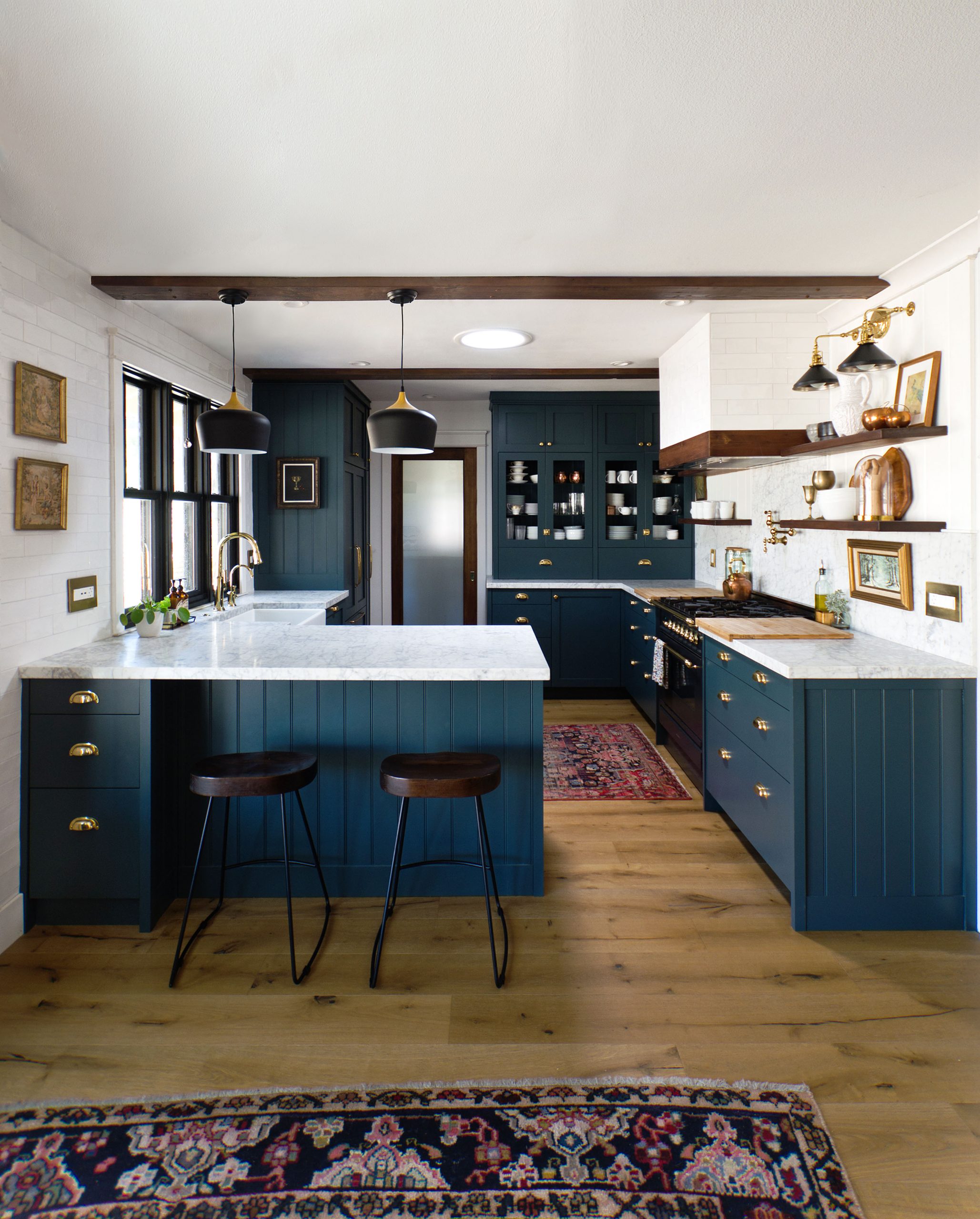
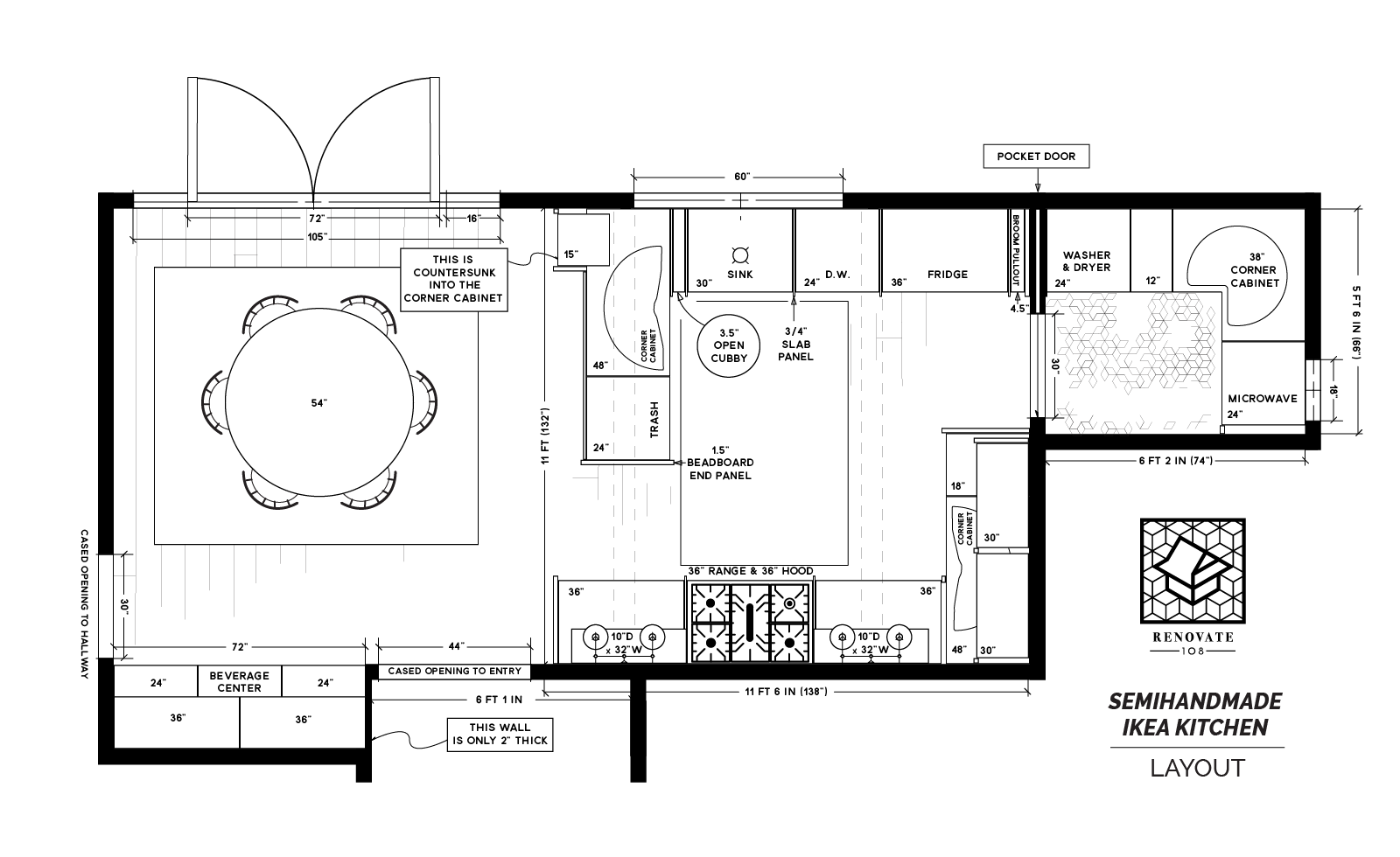
Some of the most common questions I receive (beside “paint color?!” It’s Narragansett Green, I’ll just get that out of the way) are in regard to our kitchen layout. “How big is your kitchen? “, or “What cabinets make up your countertop hutch? “. This article will answer the most frequently asked questions, and hopefully more!
However, in order to understand why our kitchen layout is the way it is, it is important to understand where we began, and the choices we made to adjust the existing layout to utilize the space in the way we felt was most beautiful and efficient!
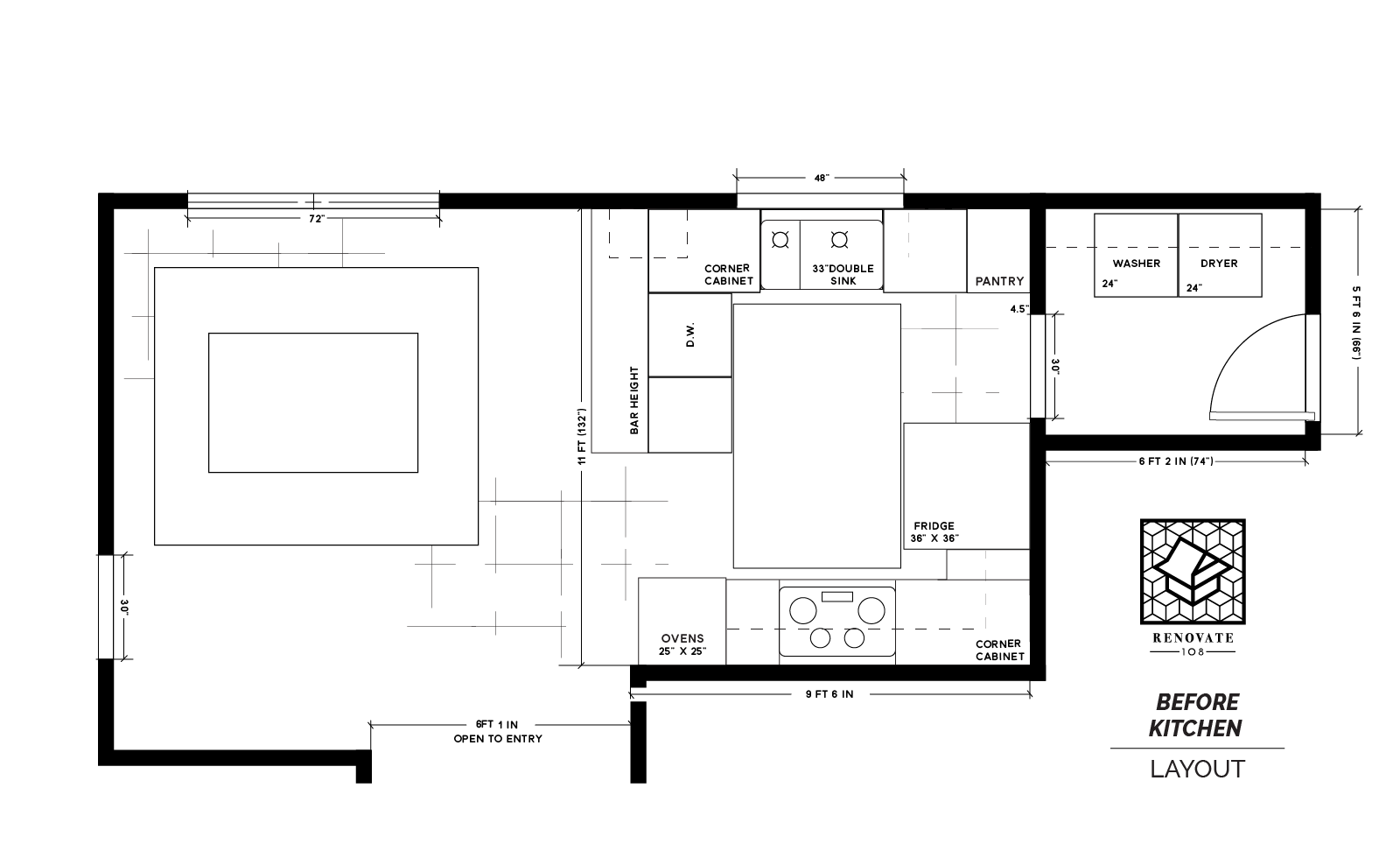

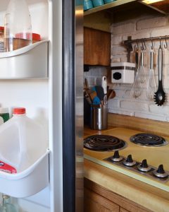
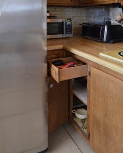
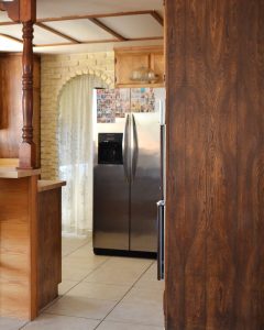
When we moved in, our kitchen had not been updated much since our house was built in 1964. It had the original appliances and cabinets, although I suspect that the counters MAY have been replaced at some point (I’m not 100% sure of that, because the sink was still the original mustard color that matched the stove top and range hood, and it is questionable that they would have kept the sink but replaced the counters? But perhaps they did). Someone had taken down the cabinets that floated over the peninsula and hung them in the garage at some point, and installed the brick veneer, faux arch (which was definitely cute, but also falling apart) and a dishwasher. Other than that, I think the contact paper in the cabinets may have even dated back to the 60s. In regards to the layout, mostly we liked it (In general, we really like the layout of this house). The double-L shape felt friendly and comfortable, and there wasn’t much we could do to change the basic shape without totally reconfiguring our house (which we didn’t want or need to do).
However, the fridge placement was very problematic, the corner cabinets were almost useless, and the pantry was too narrow and deep. The fridge doors opened into the stove top, and blocked drawers from opening fully. We also didn’t enjoy walking into our kitchen and BAM! Giant hunk of stainless steel in yo face. We also felt like there was a lot of underutilized space in the laundry room and the dining area.
So, final layout of our new kitchen came together quickly; we’d stick with the double-L layout, with the sink and the stove close to their original positions, but we’d solve the problem of the fridge location, while providing significantly more counter space and usable cabinet space by extending the range wall, and adding cabinets to the dining space and laundry room, all without increasing the square-footage of the kitchen.

